
Last term one of my Year 5s handed me a graph of our class's favourite fruit. It was neat and carefully coloured, and it was a line graph. Apples joined to bananas joined to mangoes, the line going up and down like a mountain range. I asked what the line between bananas and mangoes showed. She thought for a while and said, "The fruit in between?"
A lot of Stage 3 students are right there. They can draw a graph. What they haven't practised much is deciding which display the data needs, setting a sensible scale, and asking whether a graph is telling the truth. That's most of what the NSW syllabus asks for in Years 5–6.
What the syllabus asks for
In the NSW Mathematics K–10 Syllabus (2022), Stage 3 data has two outcomes. MA3-DATA-01 "constructs graphs using many-to-one scales" and MA3-DATA-02 "interprets data displays, including timelines and line graphs". The content is split into Data A and Data B. A is often taught in Year 5 and B in Year 6, but NESA leaves that to schools.
Data A covers collecting categorical and discrete numerical data by observation or survey, tabulating it with and without spreadsheets, choosing a suitable display and scale, and drawing column graphs with a many-to-one scale and timelines. Students also interpret line graphs using the scales on the axes, and work out the total number of data values in a column graph.
Data B is mostly interpreting: side-by-side column graphs for two categorical variables, timelines, comparing displays by the shape of the distribution, the range and the mode, and checking data in the media for bias and misleading representations.
Mean and median are Stage 4, and so are pie (sector) graphs, histograms and dot plots. I show them to students who are ready, but I call them an extension.
Types of graphs in Year 5 and 6
When teachers search "types of graphs year 5" they usually want a list. These are the displays I teach in Stage 3:
- tables, including tally and frequency tables
- column graphs with a many-to-one scale
- side-by-side column graphs, for comparing two groups (Year 5 and Year 6, Term 1 and Term 3)
- line graphs, for something that changes over time
- timelines with an even scale, like 1 cm = 10 years
Choosing between them is the harder job. The syllabus example: cinema ticket prices suit a column graph or a table, and the height of a plant over time suits a line graph. I give students one question. Are you comparing categories, or showing change over time? Categories get columns, change over time gets a line. If a student can't tell me what the line between two points means, it shouldn't be a line. NESA's teaching advice backs this up: line graphs shouldn't be used with discrete data.
A quick activity that costs nothing: write six data sets on cards, like the favourite sport of 30 students, the temperature every hour on sports day, or lunch orders in Year 5 compared with Year 6. Pairs sort them by best display and write a reason on the back. Expect some arguing, usually over the temperature one.
Many-to-one scales
MA3-DATA-01 is about the many-to-one scale, where one unit on the axis stands for more than one of whatever is being counted. The errors here are very predictable:
- Uneven jumps. A student runs out of room and goes 0, 2, 4, 6, 8, 10, 14, 16, so every column above 10 is wrong.
- Reading a gap as the next number. On a scale of 5, a column halfway between 10 and 15 gets read as 11.
- A scale of 1 for data that goes up to 50, so the graph runs off the page.
- No axis labels, or a y-axis that just says "Numbers".
I teach choosing a scale as a small calculation. Find the biggest value, count the lines you have, divide and round up to a friendly number. Biggest value 50 books, about 10 lines, so each line is 5 books. I get students to say it out loud: "Each line stands for 5 books."
Then I hand out a graph that's wrong on purpose, because students are far keener to fix someone else's work than to check their own. In the Types of Graphs Flip Book and Spinner it's Leo's speedy graph. He skipped 12 on his axis, drew one column too short and forgot the title.
Every graph gets a title, and both axes are labelled with what they measure: "Way of travelling" and "Number of students", not "x" and "y".
Surveys and statistical investigations
Data A starts with students posing and refining questions to construct a survey. First drafts tend to be leading ("Don't you agree chocolate is the best flavour?"), ask two things at once ("Do you like ice-cream and lollies?") or leave out an "other" option.
The syllabus example of a 1 to 5 rating scale (1 = don't like, 5 = like a lot) is worth borrowing. It gives you ordinal data, and a reason to talk about keeping the categories in order along the axis.
For analysis, the Stage 3 words are total, range, mode and shape. Range is the highest value minus the lowest, and the mode is the most frequent value or category. Shape is what the graph looks like: bunched at one end, spread out, one tall column. "How many students were surveyed?" is a better question than it looks, because plenty of students read the tallest column and stop.
The Statistical Investigation unit runs three investigations (ice-cream flavours, number of pets, and Year 5 and Year 6 movie choices), each with collect, present and analyse pages. Dot plots, median and mean are on separate slides labelled as Stage 4 extension.
Spreadsheets
Data A asks students to tabulate data with and without spreadsheets, and to construct many-to-one column graphs with and without digital technologies. I have students draw by hand first. Once they know what a good graph needs, they can check what the spreadsheet has done.
In Excel or Google Sheets, watch for charts without the axis titles you want, and for a vertical axis that starts above zero and makes small differences look huge. Writing down the steps they took, clearly enough for someone else to follow, is harder than students expect. The Spreadsheet Graphs resource has step-by-step instructions for both programs and a hand-drawn option for students without a device.
Misleading graphs and bias
This is my favourite part of Data B. Students identify misleading representations of data in the media (the syllabus gives broken axes and graphics not drawn to scale as examples) and possible sources of bias, such as who paid for the data collection and whether it's part of an advertisement.
Draw two column graphs of the same data, one with the y-axis starting at 0 and one starting at 40. Ask which shows a bigger difference, then ask which one is honest. Then hand out a catalogue or a printed news graph and let students hunt. I also give them a few questions to ask of any graph: Who collected this? Who paid for it? Who was asked, and how many? Does the axis start at zero?
Resources that go with this post
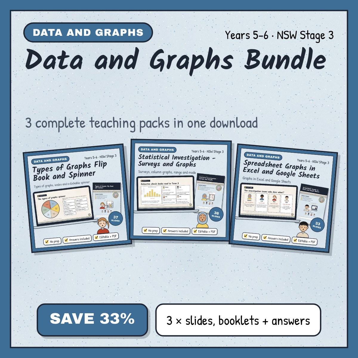
- Types of Graphs Flip Book and Spinner: reference cards, a clickable spinner on the slides, a many-to-one column graph, a graph to fix, a line graph, a timeline and a flip book.
- Statistical Investigation: Surveys and Graphs: survey questions, three investigations, range and mode, side-by-side column graphs and bias in the media.
- Spreadsheet Graphs in Excel and Google Sheets: a bike rack investigation, side-by-side column graphs, a line graph and an assessment task with a rubric.
- Data and Graphs Bundle: all three together.